You can’t really write about craft beer labels without talking about Mikkeller.
So recognisable is the Danish brewery’s artwork, that there is now a standalone webstore which sells limited edition prints worldwide.
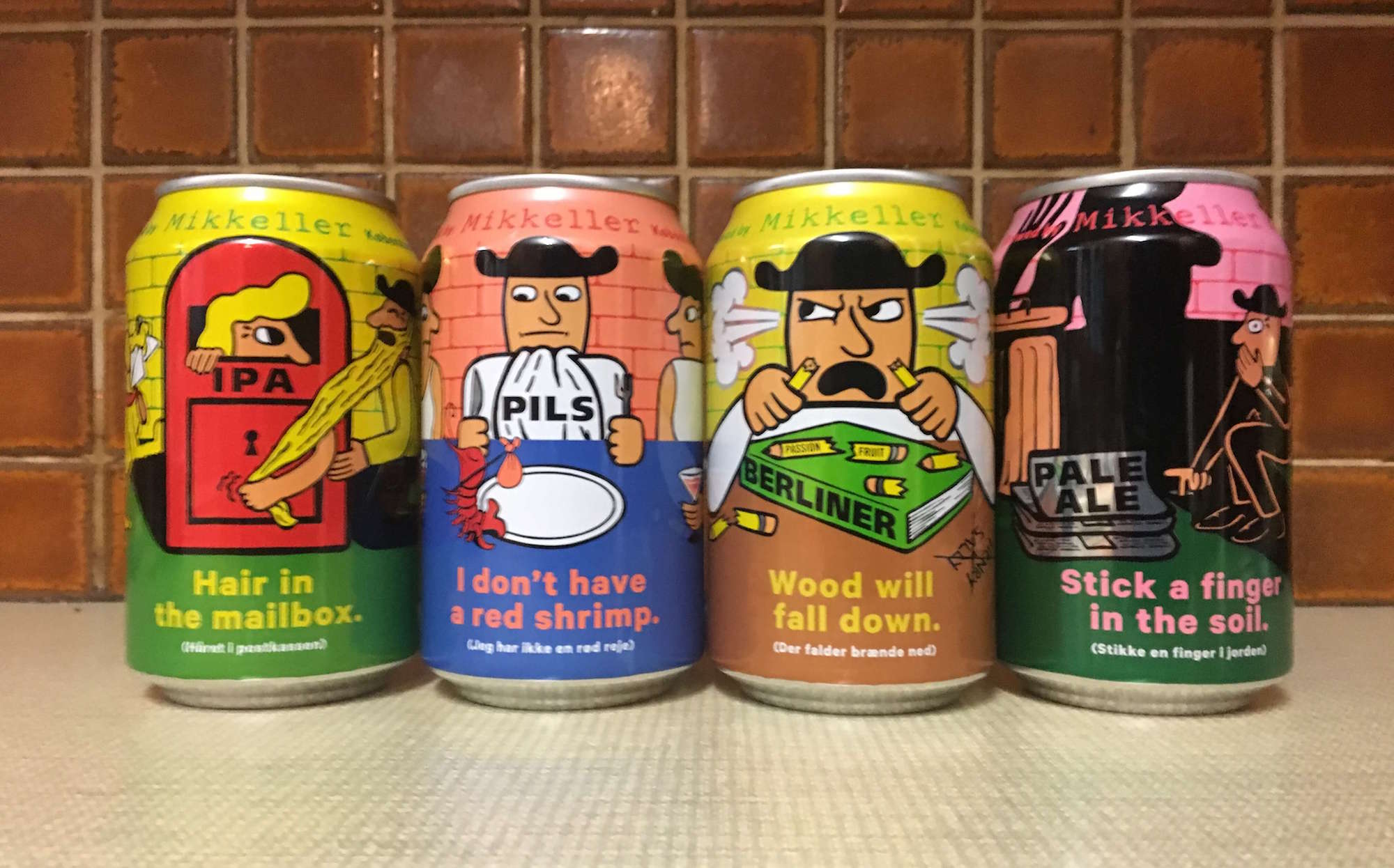
Keith Shore, Mikkeller’s Art Director, uses a limited colour palette to great effect, creating quirky, cartoonish designs which catch the eye.
Labels often feature beer-loving characters Henry and Sally and are unique to each beer.
I instantly recognised cans of Mikkeller’s new year-round series now sold in Marks & Spencer for £2.79 a can.
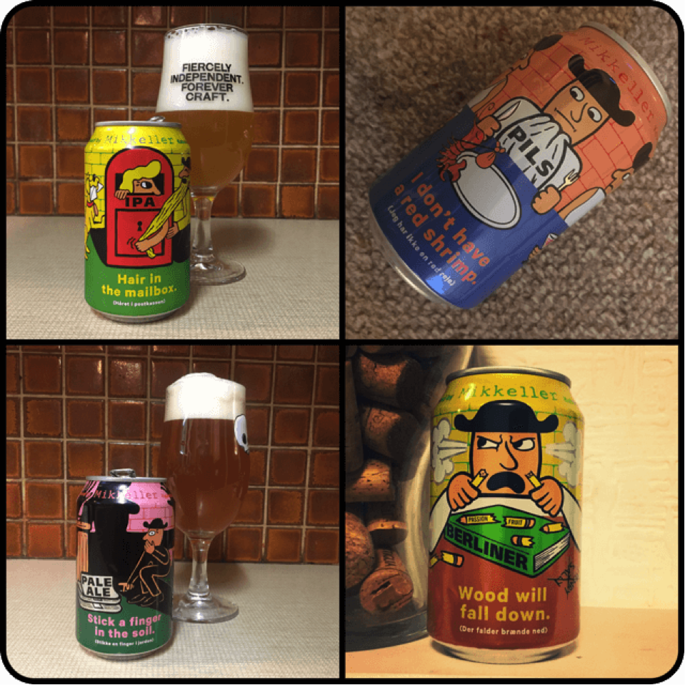
I like how the beer style is incorporated into the wacky labels.
- Hair in the Mailbox – India Pale Ale
Hair in the mailbox seems pretty wrong to me, who would want hairy letters? Even so, the artwork for this one is fun, bright with a dog and a beard. What’s not to like. I really enjoyed this fruity IPA. It’s a light yellow-orange in appearance with a slight haze.
A great foamy head, which lasted. My favourite of the bunch. - Stick a finger in the soil – Pale Ale
Creepy artwork, which looks somewhat rude, but I am not sure why. I stuck my tongue in the beer instead. It tasted pretty good. Amber-gold in colour, and slightly hazy. It’s well balanced, with apricot citrus and bitterness rounding out the flavours to finish. Tasted fresh, with a tight foam head. - I don’t have a red shrimp – Pilsner
I’d be annoyed too if my Shrimp walked off before I could tuck in.
Golden-straw in appearance, slight mango nose with caramel. Biscuit and lemon on palate. The beer seems soft and somewhat thin. I think it needs a bigger whack of bitterness, but that’s just what I prefer with pilsners. - Wood will fall down – Passionfruit Berliner Weisse
Wood certainly does fall down if my garden is anything to go by. TRUTH. I am not always keen on Berliner Weisse, but maybe as I do love Passionfruit this one I enjoyed. It seemed to have balance, with sweetness to balance the sourness.
What do you think of the artwork and the new year round range? Let me know in the comments.

0 Comments