Earlier this year, I returned to Stoke Newington Literary festival for another discussion about beer and books.
The event was called ‘Original Gravity Live’. For those less familiar with obscure beer language than me, ‘Original Gravity’ is a brewing term and is used to figure out the final strength of the beer being made. It’s fallen out of use with the general public as these days, with ‘ABV’ being used to denote alcoholic strength.
However, Original Gravity is also a monthly beer magazine, available in print and digital formats.
At the event, the publication’s editors Pete Brown and Adrian Tierney Jones were joined up on stage along with the Founder.
The discussion was not just about literature and beer though – a significant part of the talk revolved around the artists involved in producing can and bottle artwork for some of the well-known breweries.
This got me thinking about producing a series to highlight the stunning artwork and design that goes into many labels – my aim is to share my favourite label with you each month.
To kick things off, my choice for October is:
Cloudwater x Collective Arts Brewing – Lower Than Zero
Artwork: Textbook Studio
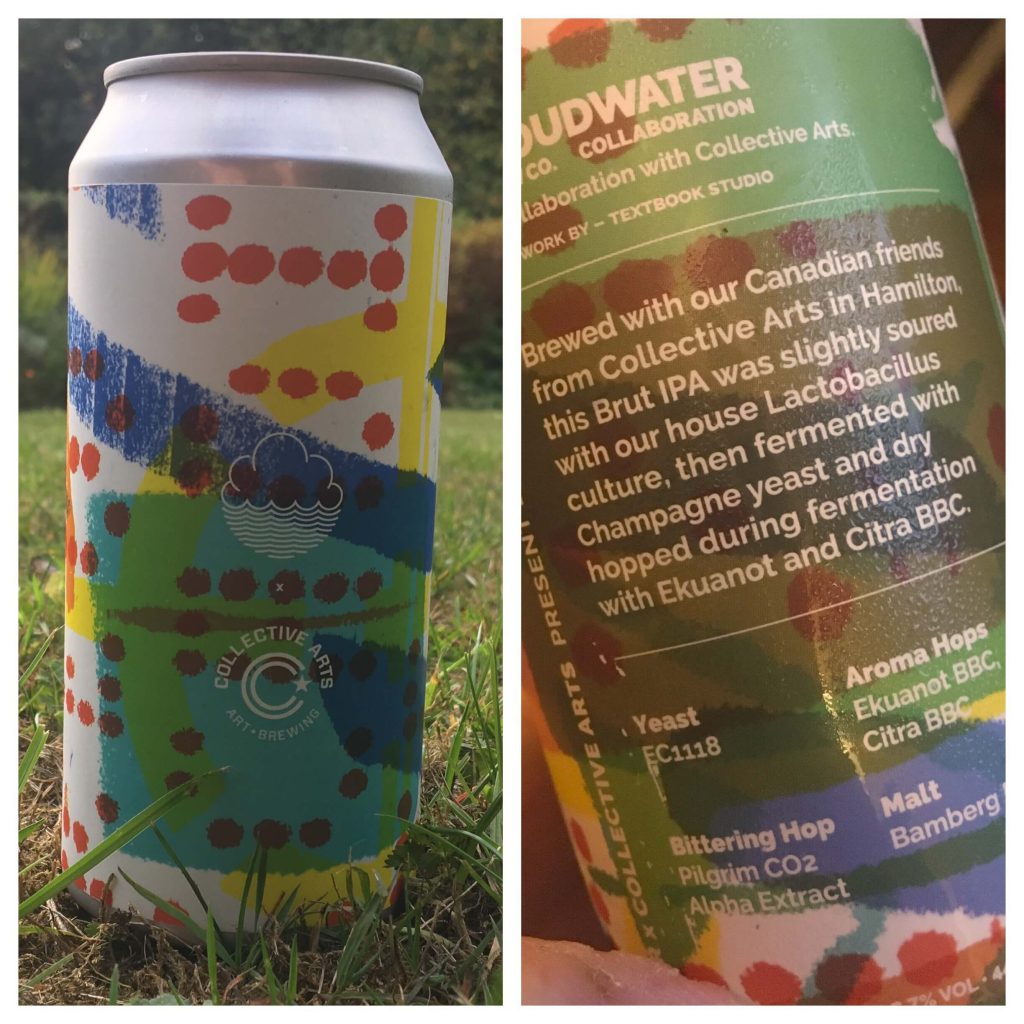
The beer is a collaboration from Manchester’s Cloudwater with Collective Arts Brewing, from Toronto in Canada.
Collective Arts are a brewery that work with artists and musicians to produce unique artwork and beers. Fitting then that they are involved in the beer in the first label I discuss.
Cloudwater produce a never-ending selection of seasonal beers – with unique artwork on each of their distinctive 500ml cans.
Inside is a Sour Brut IPA. It’s slightly sour, with a lot of fruity hops, but the addition of Champagne Yeast helps to make this a dry beer. Yes, it’s odd alright.
I was enjoying it, but the yeast character which comes through at the finish is quite unpleasant. I expected more from it, having enjoyed a few Brut IPA’s at LCBF.
Luckily, the artwork is better than what’s on the inside.
Cloudwater is a regular customer of Manchester-based Textbook Studio, but this can has a different aesthetic to most of their other work.
This artwork stood out for me with the use of bright colours in a unique, abstract way. I felt like something was written with the red dots, but it’s hard to see what it could be. Perhaps this is indicative that this beer is a genre-crossing, ocean-crossing collaboration.
Scores
- Beer: 4/10
- Artwork: 7/10
- Shop – Cloudwater Cans




0 Comments